






Commercial Vastu · 19 September 2026 · 6 min read
Colours for Office Walls as per Vastu
Which colours suit the owner's cabin, reception, accounts and conference room? A practical guide to office colour Vastu by direction, element and purpose.
By Dr. Kimaya Parikh-Ambekar, Vastu consultant, Andheri East, Mumbai
01
Why do office wall colours matter in Vastu?
Office wall colours matter in Vastu because each direction is linked to one of the पंचतत्व (Pancha Tattva, the five elements), and colour is one of the simplest ways to support that element. A well-chosen palette helps a workplace feel focused, welcoming and steady, while clashing or very dark shades can make a space feel heavy.
Colour is also a practical remedy for Mumbai offices. Most commercial units are leased, cabins are made of partitions and landlords may limit painting. A single accent wall, a panel, artwork, upholstery or a rug can carry a Vastu colour just as well as a full coat of paint.
02
Which colours suit each direction of an office?
Choose colours by the element of each zone. These are general associations; an office's layout, lighting and brand colours are considered together before a final palette is suggested.
01
North (Water, Kubera)
Greens and light blues, often linked with opportunity, cash flow and new clients.
02
North-East (Water, Isha)
White, cream and pale yellow to keep this sensitive zone light and clear.
03
East (Indra/Surya)
Light green, white and soft sky tones for freshness and growth.
04
South-East (Fire, Agni)
Orange, peach, pink and warm light reds in moderation.
05
South (Yama)
Coral, pink and warm earthy tones that feel confident without being loud.
06
South-West (Earth, Nairutya)
Beige, sand, light brown and earthy yellows for stability.
07
West and North-West (Varuna, Vayu)
White, grey, off-white and soft silver shades.
03
What colour is suitable for the owner's cabin?
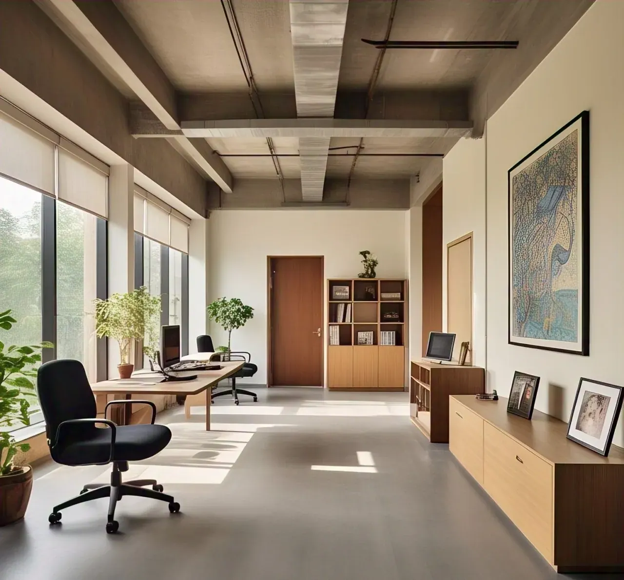
The owner's cabin suits earthy, settled shades such as beige, sand, light brown or a soft terracotta, because it traditionally sits in the South-West, the Earth zone of stability and authority. The owner faces North or East, so the wall behind the chair can carry the warmer, grounding tone.
Avoid very dark browns or greys over every wall, which can make a compact cabin feel closed in. A cream ceiling, good lighting and a single deeper wall give both authority and openness. If the cabin is in another zone, the colour is adjusted to that direction.
04
Which colours work for reception, accounts and conference rooms?
Each area needs a colour that suits both its direction and its purpose. Reception and waiting areas should feel welcoming, accounts should feel orderly and calm, and meeting rooms should support clear discussion.
01
Reception
Cream, light green or soft warm neutrals, especially when reception is in the North or East.
02
Accounts and cash
Soft greens or light blues in a North zone; keep lockers opening towards the North or East.
03
Conference room
Whites, soft greys and off-whites suit the North-West or West, where conference rooms are commonly placed.
04
Pantry
Warm peach or light orange accents suit a South-East pantry.
05
Workstations
Light, neutral backgrounds keep large open areas calm, with colour introduced through boards or partitions.
05
Which colours should be avoided on office walls?
Avoid large areas of very dark, dull or aggressive colours, and avoid heavy shades in the North-East. No direction is bad, but a deep maroon or black wall in the North-East, or bright red across a whole workspace, can feel draining over a long working day.
01
Too much red
Use red and bright orange as accents, not whole rooms, to avoid restlessness.
02
Black and charcoal
Fine in small décor details, but heavy on full walls in a small office.
03
Dark North-East
Keep this zone pale; move dark cabinets or dark panels elsewhere.
04
Peeling or stained paint
Damaged walls feel neglected; repair them promptly, especially in reception.
07
Can brand colours be used in a Vastu office?
Yes, brand colours can be used, as long as they are placed in zones that suit them or balanced with neutrals. A red or orange logo wall fits naturally in the South-East, a green or blue brand fits the North or East, and a brown or gold identity sits comfortably in the South-West.
If the brand colour must appear at the entrance whatever its direction, keep it to a sign or a band and surround it with light, harmonious shades. Colour works alongside lighting, so a well-lit reception with a strong brand accent usually feels balanced.
Finishes matter too. Matt or eggshell paints feel calmer than high-gloss surfaces on large walls, and warm white lighting softens strong shades. Test a patch of each shade on the actual wall and look at it in morning and evening light before you commit.
08
When to consult a Vastu expert about office colours
Consult before painting, fit-out or rebranding, so colours follow the office's measured directions rather than a generic chart. Dr. Kimaya Parikh-Ambekar matches colours to the direction, element and purpose of each area, and combines colour with crystals, pyramids or lighting where needed.
VastuKimaya is based in Andheri East. Dr. Kimaya visits offices across Mumbai for compass measurement, and can also advise from floor plans and photographs through a distant consultation, followed by a written report and follow-up after painting.
Questions
Frequently asked
Which colour is lucky for an office as per Vastu?
No single colour suits every office. Greens and light blues are commonly used in the North for opportunity, and earthy beige in the South-West for stability, but the right colour depends on the zone and its use.
Is white a good colour for office walls in Vastu?
Yes, white is a calm, versatile colour that suits the North-East, West and North-West, and works as a neutral background elsewhere. Add warmth with accents so the office does not feel clinical.
Can I use grey in my office as per Vastu?
Yes, soft grey suits the West and North-West and works well in conference rooms. Avoid very dark grey across a whole small office or in the North-East.
What colour should the office cash counter area be?
Soft greens or light blues suit a cash area in the North, the zone of Kubera. Keep it clean and well lit, with the locker opening towards the North or East.
Do office colours need to be changed if the brand uses red?
No, red branding can stay. Place strong red elements in the South-East where possible, and balance them with neutral or light shades elsewhere.
Want this applied to your own home or office?
Book free consultation